Testers Needed for Rhapsody v3
-
@David-Healey Of the left-edge arrows, I prefer the one with the tail. Seems fairly obvious what it does when you see it. But it's also easy to miss in the UI because it's separated from the preset browser.
Maybe a different icon in place of the grid, next to the preset browser?
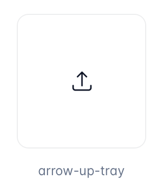
I know this is usually 'upload' but if you have an 'Unload' tooltip on hover it might be clear enough.
Also, if the Unload button is near the preset browser, I think it should be right next to it instead of the settings icon.
As a user, I might also expect to be able to click on the expansion name to load a different one, or get back to the library.
But on the whole, if the action of the button is to take you back to the library so you load another expansion, then the left-edge arrow button is probably best.