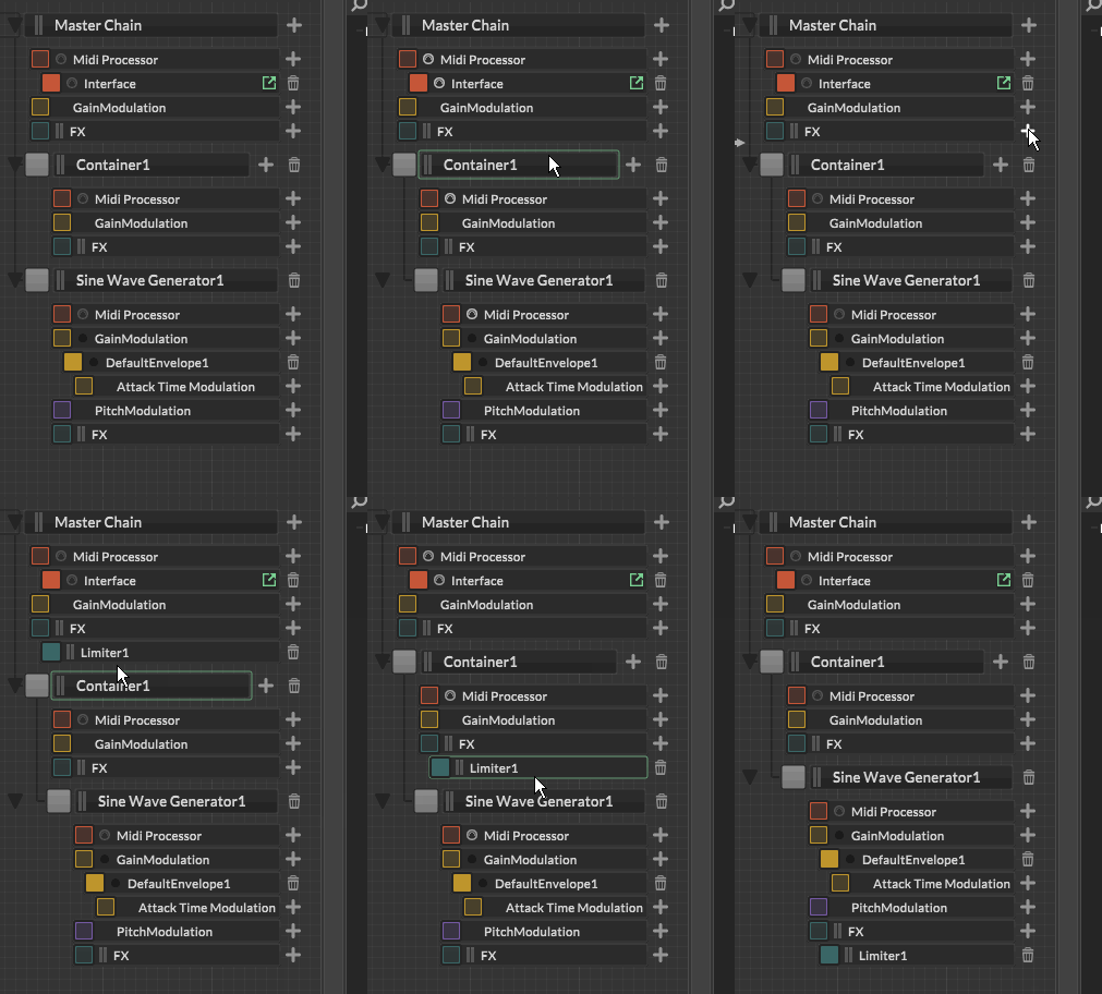
Ability to move sampler / synth / container modules around
-
Thought about this today as I was editing the XML -- don't know how much of a pain it is to set up drag and drop for the HISE IDE natively, but if it's anything like setting it up for our own GUI within HISE (and frankly in any other framework I used), it's a pain in the ass with a bunch of edge cases where things can go wrong.
So I thought if buttons for up/down were visible on modules when the edit mode is enabled, it would be enough. the buttons would then be about shuffling the xml content around. Up/down would only move it up/down within the container.
right clicking would have the option to "re-child into the container above" for a module that's right underneath a container (similar to how foldering works in Reaper), and then the buttons would move it within that container only. there would also be an option in the right click to "de-child", which would move it out of its current container and place it below it.
-
@aaronventure said in Ability to move sampler / synth / container modules around:
don't know how much of a pain it is to set up drag and drop for the HISE IDE
Well we already have it for the component list.
-
@d-healey That's true. But the realtime onTimer callback runs in seconds, the and the timer objects in milliseconds so I won't pretend to know how the sausage is made and what goes on in the meatshop behind the counter

-
Alright guys, here we go:
https://github.com/christophhart/HISE/commit/888851ed2353eec4684cd94ea0d5db5d2dae84ff
I tried to cover a few common edge cases, but I'm sure there's lots to discover when doing monkey testing, so let me know if you find glitches...

-
@Christoph-Hart Excellent!
-
christophhart Already? I can't imagine what we're getting for Christmas, then!
-
@Christoph-Hart wow. Bravo! That looks great. This is a serious UX improvement. Thank you so much!
-
@Christoph-Hart
Getting a couple build error on MacOSHISE/hi_backend/backend/debug_components/PatchBrowser.cpp:1512:23 Ambiguous conversion from derived class 'hise::PatchBrowser::PatchItem' to base class 'hise::Processor::BypassListener': class hise::PatchBrowser::PatchItem -> class hise::PatchBrowser::ModuleDragTarget -> class Processor::BypassListener class hise::PatchBrowser::PatchItem -> class Processor::BypassListenerHISE/hi_backend/backend/debug_components/PatchBrowser.cpp:1548:40 Ambiguous conversion from derived class 'hise::PatchBrowser::PatchItem' to base class 'hise::Processor::BypassListener': class hise::PatchBrowser::PatchItem -> class hise::PatchBrowser::ModuleDragTarget -> class Processor::BypassListener class hise::PatchBrowser::PatchItem -> class Processor::BypassListener -
@Christoph-Hart rules

-
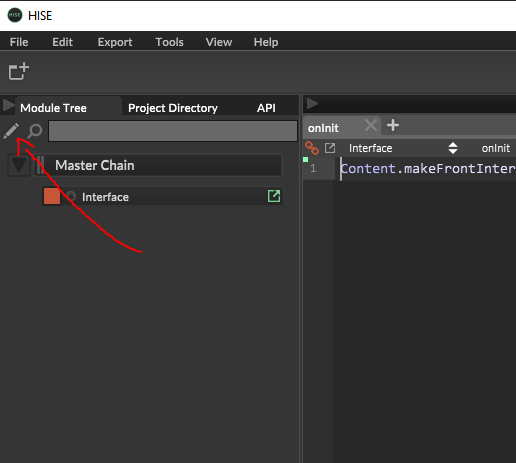
@Christoph-Hart this is an awesome quality of life improvement! I'm on the latest Develop build but I can't see any of the extra stuff - there's no + and bin icons, and I still can't drag-and-drop the modules around. Is there something I need to enable to get this or is it another branch or what? ;-)
-
@tomekslesicki did you go into edit mode first using the pen? ( i know it is a little bit confusing)
it would make sense to have the drag /re arrange option in both modes tho imo -
it would make sense to have the drag /re arrange option in both modes tho imo
No I think this will lead to moving modules around accidentally too often, also from a UX standpoint I think it makes sense to restrict moving (aka editing the graph) to the edit mode.
-
@Christoph-Hart yeah maybe, but people are kind of used to a certain workflow and i am not aware of any other "layer based" software that does not support dragging on the layer view.
I use bitwig, ableton, photoshop, figma, adobeXD, Illustrator, Blender and Cinema4D and they all have this layer drag behaviour.
But they are creative tools (and maybe not comparable to HISE) but they definitely are highly workflow optimized and therefore simplified from a UX standpoint.
-
@Straticah ah, no, I didn’t know this was required! I’ll look for that pen tomorrow when I’m back at the studo, thank you :-) Is it somewhere close to the graph or hidden in some smart place @Christoph-Hart ?
-
-
@Straticah @Christoph-Hart Either way works equally well when you are aware of how to use it. But, being able to do it without unlocking first is more intuitive. I do see a point in preventing accidental moving. I just wonder how easy and likely it would be to accidentally move it...
-
@Christoph-Hart I agree, this should be the default interaction mode. It's very easy to click on the modules, I have not had a single accident when I dragged something around not intended.
-
@tomekslesicki i can imagine giving the components a bigger height might work aswell and is less fiddly. At least in the default view where quite a lot of vertical space is unused.
-
 G gorangrooves marked this topic as a question on
-
 G gorangrooves has marked this topic as solved on
