Expandable GUI
-
-
-
@Christoph-Hart A friendly bump. +100 for this.
-
@orange +1 breaking my head squeezing everything into one interface :)
-
@oskarsh one more lane, bro:)
-
@Christoph-Hart its always just one more lane ...
-
@oskarsh I understand how this feature can seem appealing, but consider the possibility that this is simply a shortcut around creating a better user experience.
Human short-term memory is limited to half a dozen items. That's all we can keep track of. Anything beyond that means that before we engage with its functionality, we must engage in subverting the cognitive load required to incorporate the information.
Interfaces should have the fewest number of items. Use affordances to extend the functionality of existing items. Instead of adding more elements, make the existing ones more powerful.
Also, consider that at any one time, there shouldn't be more a few things that a user would want to do in your plugin. If there are more, then consider reengineering your user experience and organise tasks based on their context.
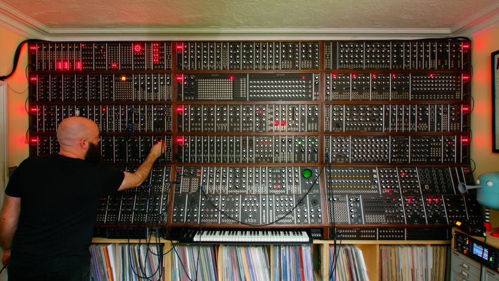
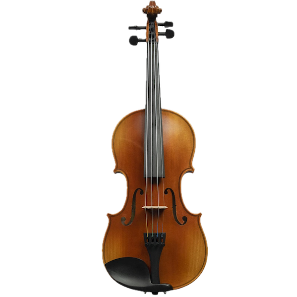
Sometimes, this means you get rid of features that you like, and even that people may want. (You may have heard the expression, "killing your babies".) The gradient should always be toward less that does more. It's not the number of parameters that make an instrument expressive.
This instrument is neither powerful nor expressive:
This one is both:
There's lots of ways to do this, of course. The one I've been using in HISE is Contextual Interfaces. My plugin has a zillion different parameters, but at any one time, the only ones visible are the ones which are relevant. The workflow is organised to guide the user, such that there's only a small number of things that the user would want to do (while still having the full power of the plugin at their fingertips). Here's a debug view of one section.
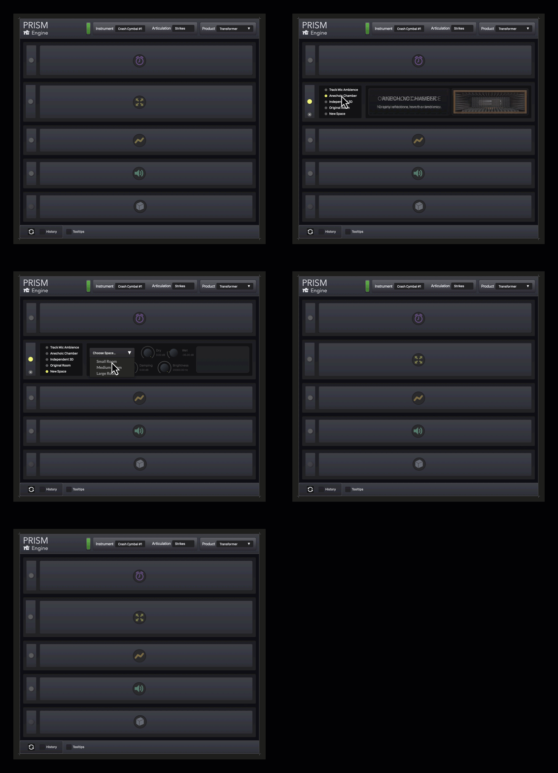
Controls that are not relevant are greyed out, with different levels of transparency. As you perform tasks, you'll see (in the background) widgets come closer as they become more relevant. If they reach the foreground, you can use them. Some widgets are initially amorphous — as they become more relevant, they began to take on clearer visual traits. These visual traits translate specifically to the widgets that are exposed at this level of specificity.
The six sections divide this section of the plugin into six workflows. While you're engaged with one of these workflows, you wouldn't want/need to engage with the others, nor care about visual feedback. For example, if the user is in the spatialisation module, they're not interested in gain-staging, so that's a separate module.
Although not shown here, these six modules are further collapsed into a single module, giving the interface a tiny GUI that is more powerful, intuitive and efficient. In turn, this whole section is one of seven sections in the plugin. Each of these sections have, in turn, been designed and delineated by mutually-exclusive workflows.
Let's go down the rabbit hole. For example, the gain staging module has a limiter. You can't access the limiter unless you're already looking at the clip light. Which you're only doing if you suspect your signal might be clipping. If so, then a solution to the problem appears right next to the clipping light — the limiter switch. But otherwise, the limiter switch is just noise. (To put it another way, nobody wants to use a limiter. It's only relevant if there's a problem.)
Going deeper: There's no controls on the limiter. Based on the context, there is only one thing they want the limiter to do — stop the clipping, with complete transparency. And if a tool only does one thing for the user, then it should only present one interface widget to the user. You may be thinking, "But limiters are not transparent, which is why they have adjustable parameters — so users can decide the trade-offs." And while that's true, it's also not the user's problem — it's mine.
Complex interfaces can also affect your sales. Prospective customers may think the plugin with lots of controls, expandable panels and such — is cool. But it's also overwhelming. They can't imagine themselves actually using it. Your user interface should look simple and feel powerful.
There are also practical concerns. Most people use laptops. Screen real estate is at a premium. Whenever a plugin is open, it will initially be obscuring some part of their DAW. And the last thing anyone wants is for a plugin to suddenly take up even more space. They may have carefully placed your plugin window so it's not stepping on anything — but if it suddenly gets bigger, all bets are off. When your interface expands, it may not even be on the screen.
Just my $0.02.
-
@Christoph-Hart As you can see, everyone is asking you to add this feature. It shouldn't be hard for you since lots of companies are using this feature.
@clevername27 while 100 people want this, it is very unreasonable for one person to come out and oppose it. If you don't want to, don't use this feature, it's that simple! When this feature is added, nothing will happen to plugins that do not use it. Many people have talked to you about this topic before, but you're still buzzing... Many experts here (plus tons of companies use this in the market) will not take GUI lessons from you. Please do not take such approaches.
-
This post is deleted! -
This post is deleted! -
@Fortune I thought @clevername27's post was very reasonable - and interesting, to be fair. What's the point in a forum if people can't express their well-thought-out opinions!

You don't have to read it... ?

-
-
@WepaAudio ha, nice!
-
You da man!

-
Can we get a short EXAMPLE tutorial? I mean the Function etc, basically how to do it?
-
@DabDab said in Expandable GUI:
Can we get a short EXAMPLE tutorial? I mean the Function etc, basically how to do it?
I'm sure we'll get some docs, but let's have patience, he literally added it 30 minutes ago :)
-
@DabDab @d-healey There's already an example in the snippet browser :
HiseSnippet 1043.3ocsV01aaaCDlxNJn1asXEX+.3zmj2BLryZVKxvVS7KYyX0oF0YECXXnflh1hHRjBRzM0an.6m294r+AYGI0atwcqvX0ewhGu64d3o6dnlkJorrLYJxo0UaRXHmO0c9FgJbXHgKPSFgbdf6TRlhkhslFrIgjkwBPNNM+AsAmVGfL+96mNfDQDTVkID5kRNk8LdLWUYc1Y+DOJ5BR.6JdbMuezYSnRwPYjbMvmlt8PID50jUrKIZ2Z3hbNbb.WISmqHJVFx4fAxfMyCk2Hr9+RdFeQDSunOZN.j07Exn.Mi0VQCC4QAyJN2YH.kYUUgl1pvm6NkGvKsWUM9LyF3pHpWObZrM8ZtE85Wmd8pQucPImZT5.Kkdn6bZJOQUsilOeh6DA7xYIAJ60oh0WTiIMcGJAODptwjqYWjBKJiv+3d8NB2uWuNea61s4hHtfgWtVPUbo.KEufkw+c1f0Jk90hPkJi7ox3Do.v6H7qIQqYcZ+GsaUjhLl5GY7UgJe.T7WY8.+k3SzY3sPRJbbESMr.Heu54wqiFk7rMjDEs.5A72IWzrFZXxTPdRwI3uCW.OIHXFQvh78L+026Hb4AMQiuu2M7.UHX+35F4JVrs+C1w9PV2TVfNSFWlA8ApWHWqfJkeQkxekoHrp6Rns97nHeUHOSeD2BvN5Rv1TdAP4whU.VcooLnmYPpjDPMia9.h7fSwdTS3PGnXECnU6VjzUYmh+0xSfWnoj68aV3WzknTDZ3Uxx2yygJmuG0.QF1BXlWtyAAOiCIT.oLA.y5UtS.5kGxaNBGZNmlS2cKWSIpvtoDQfL1uC96w85dB9okEwE5FgSemZpEpTVhtp5aqO0Z+tTpXOW3aRZ621F+tasb4N2Ku6HBNP6ZaslS5+Vf9h0wKXo06u0NBChaOc699mtqK9Ps8j0bTJlH3pmmvDuOIITdirVIHmUfqJiNvCx0AriBHdf1T8oCjg2.+bLpp+7jQDEo.I.THQIrTEWeFbFwdMHPaUXZ4NhkcsRl.ZskSm.Nen48MUR4iNaS4h+77yTr2nzZUCi3zqwSYeg9DVlfCsI39EBb5QVC92y0N9pQ1dZ1neH.dvz7Co3v+J+hlpdQsUD51as20bGcTPAWFrNhn1VVWeWV9FP2vVZo54HQFWso9cc+uo0+gRwG5Niqng6liM1AGgW4eL3X9Mj22c7xkLpphfG3dwu7w45PjUwcEHwjx08BWtNdN7llxzxhPGhdZzogdtwttWQ+xblHvr3V3W9l80qcx2rewlnXBMU9JpcZSeG78LV.NILe9QK36ff039EyWU04X3SBdEktMT2Ivi22.+58MvGsuAdx9F32ruA938Mvm7eGn9K1NesRFaGaPnoyFazDcbFKHPGnoaE8Orq1lnDOf course, don't forget to pull the changes and recompile HISE...
-
@Matt_SF said in Expandable GUI:
There's already an example in the snippet browser :
Oh that guy works fast!
-
@clevername27 I don't think you're considering the use cases where this can be highly relevant and actually improves UX in a given UI and actually goes with what you're saying (less is better).
Here's an example the advanced view GUI.
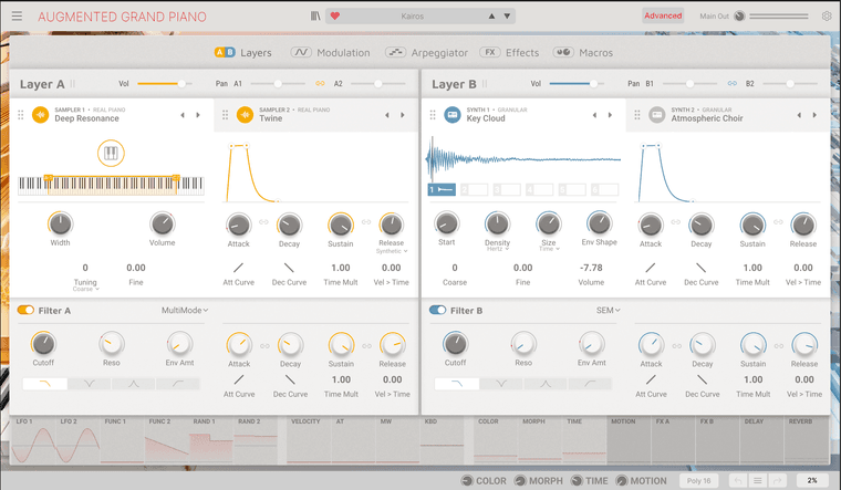
Here's that same view but after user clicks the settings icon at the top right,
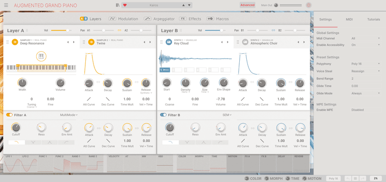
The expanding interface here lets you, in most use cases, to NOT see those controls. Which goes with what you're saying, in that its good practice not to flood users with 100s of options at once.
But when a user does need to access these global controls in this example, they aren't losing their place in the synth and they aren't going to need to tab back and forth if multiple edits are needed in the settings.
Compare this with Serum . The settings pages takes away the ability to edit the oscillators, the filters, and most of the synth's parameters.
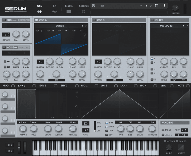
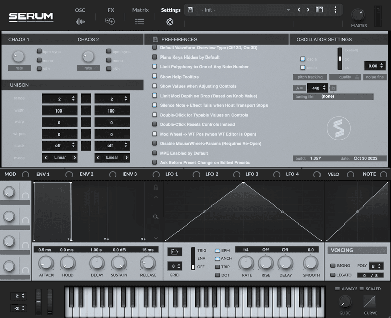
So what's a better user experience? To make the user completely leave the page they are on and have to tab back and forth or have an expanded view with the controls that need to be accessed when the user needs them? I think you can make arguments for both, but the ladder is growing in popularity.
Another interesting use case I saw of this is with a emulated compressor. The main GUI has the controls you would see on the physical counterpart, the expanded GUI keeps those in place but introduces new controls with more modern features as well as some experimental features. I think that's an excellent use of an expanding interface.
-
@ally said in Expandable GUI:
So what's a better user experience? To make the user completely leave the page they are on and have to tab back and forth or have an expanded view with the controls that need to be accessed when the user needs them?
I'd say there is no single answer for all cases.
If the user needs to be able to access the settings and still be able to tweak, then perhaps those settings should be part of the interface and not tucked away somewhere else.
If they don't need to be able to do both at once then it doesn't matter if they are taken away.
Another option is to have a popup or modal window. Depending on the specifics this can either take the user away from the rest of the UI or it can take up some other part of the UI they don't need access to while changing the settings.
I agree with @clevername27 that it's not nice to get a surprise of your window no longer fitting on the screen, so it's important with an expanding UI that the user is very clear on what is going to happen when they press the button.
I like expanding UI as an option, but generally I'd explore other options first and use the one that is most suitable. I think I'll be using the expanding UI (as I think I mentioned earlier in this thread) for showing/hiding the on screen keyboard. In this case the user won't be surprised by the UI getting larger, as it will only make the UI smaller than the default.
I might also use it to display a macro panel, because in this case the user needs to be able to see both the macro assignments and settings, and the controls on the UI that they are assigning those macros to.