UI feedback on tiny control
-
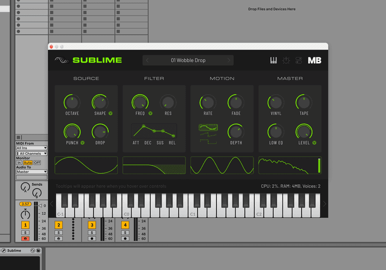
Does the Wave sector in the Motion section look too small and fiddly?
Each wave is a fairly small hit target of 44x14.
Any other ideas for choosing between 3 waves in that control area?

Meat Beats: https://meatbeats.com
Klippr Video: https://klippr.video -
@dannytaurus Looks
finesublime to me. You could also use a combo box, or a scroll box.Free HISE Bootcamp Full Course for beginners.
YouTube Channel - HISE tutorials
My Patreon - More HISE tutorials -
@dannytaurus said in UI feedback on tiny control:
Any other ideas for choosing between 3 waves in that control area?
Could also be a 3 pos knob
Hise made me an F5 dude, any other app just suffers...
-
Looks fine! Especially for something like an LFO selection.
See how tiny the Ableton dropdown selection boxes and multiple choice buttons are in the background?
-
@David-Healey said in UI feedback on tiny control:
Looks fine sublime to me
Very good!

Yeah, I thought about a combo box but that's essentially what this already is - an 'always open' combo box.
-
@ustk said in UI feedback on tiny control:
Could also be a 3 pos knob
Yeah, I tried a 3-pos knob but since all the other knobs are continuous, having one that only has 3 positions feels a bit weird. Especially since I don't want to put markers around that one knob to denote the positions.
Meat Beats: https://meatbeats.com
Klippr Video: https://klippr.video -
@griffinboy said in UI feedback on tiny control:
See how tiny the Ableton dropdown selection boxes and multiple choice buttons are in the background?
Very good point! I've always disliked the Ableton UI for that reason but the point is, that's what folks will be used to I guess.
-
@dannytaurus I like it, looks smooth
-
@dannytaurus said in UI feedback on tiny control:
@ustk said in UI feedback on tiny control:
Could also be a 3 pos knob
Yeah, I tried a 3-pos knob but since all the other knobs are continuous, having one that only has 3 positions feels a bit weird. Especially since I don't want to put markers around that one knob to denote the positions.
You could make the wavetable blend between the 3 different shapes, meaning a continuous knob still makes sense ??
-
@Orvillain Yep, that's on the list for a Plus version of the plugin. This is the trimmed-down free version.
Although I have no idea yet how to use a wavetable as an LFO. Fun future project!
Meat Beats: https://meatbeats.com
Klippr Video: https://klippr.video -
@dannytaurus You could just make a Script Time Variant Modulator and blend between 3 oscillators directly in the network. But yeah, a wavetable should be a fun exercise!
-
Does the Wave sector in the Motion section look too small and fiddly?
The waveforms are self explanatory; drop the label and enlarge them.
-
@Bart Oof, I don't think the design-nerd side of my brain could accept that!

But I did remove the background highlight and now it just highlights the actual wave selected.
Feels a bit cleaner and I'm happy with it now!

Meat Beats: https://meatbeats.com
Klippr Video: https://klippr.video -
@dannytaurus Yeah good move

-
@Bart Oof, I don't think the design-nerd side of my brain could accept that!
Thought that might be the case lol.. I'm a visual perfectionist too, but learning that asymmetry and contrasting elements are usually more interesting.
Your plugin looks great!.. because it has contrasting elements vertically, plus the ADSR and shape options break up the knobs.. Don't be afraid to make components different sizes and shapes :)
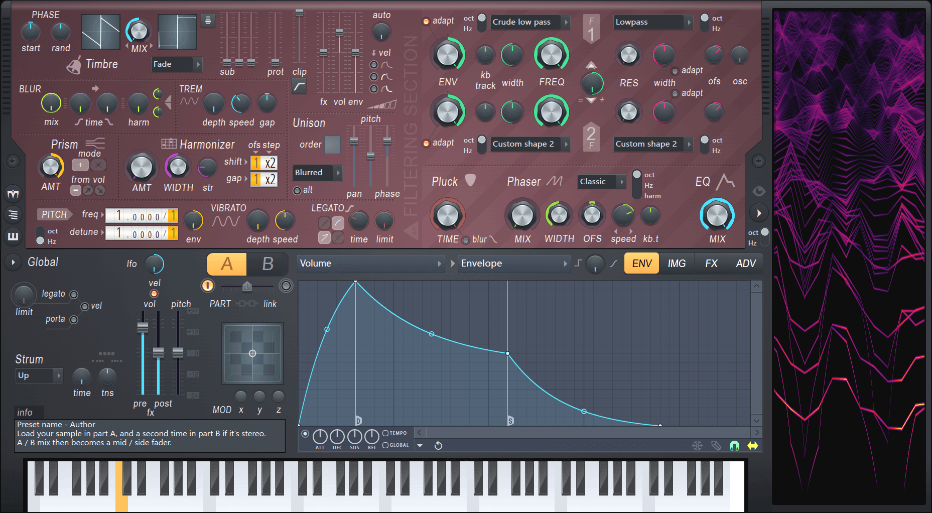
A GUI that i've always found appealing because of it's numerous contrasting components - Harmor - it's a visual treasure chest that's consistently fun to play with.
-
@Bart Wow, that interface is wild!

The synth I'm building is the start of a series, so I'm designing a layout that will work with all of them. Each one will have a couple of unique controls, so they all look slightly different but obviously from the same family.