Expandable GUI
-
@clevername27 said in Expandable GUI:
@Christoph-Hart An interface that changes size is poor design. You should never require so many on-screen widgets as to require the expansion of the interface. Think contextually.
No, you are looking at it from a very shallow and tiny perspective.
This has nothing to do with a large number of parameters. Several parameters can also be stored at the user's discretion. This has to do with flexibility.
Maybe you can choose not to use the expandable GUI from this perspective. But Users want to see this feature, just like they want the resize feature too.
For example, let's consider an fx plugin with Mid-Side feature. Users who do not want to use Mid-Side prefer to see only one channel and perform stereo processing. Users who want to use Mid-Side want to see the mid and side parts on the screen at the same time, which is important for them in terms of intervention. In such a case, the screen expand feature can be used for users who want Mid-Side.
Or another example: while some users want to see a huge analyzer on the screen, some do not. The expand feature can be used for this.
These were just two examples, even if you do a little research on other forums, you can understand that the expandable GUI feature is a feature sought by users.
Besides, many leading developers use this feature in their plugins as new plugins are released every day.
-
@clevername27 The expanding interface is probably the best compromise when considering primary use cases and the addition of more in depth features for power users.
The long-standing alternative is tabs or pages.
The expanding interface affords the ability to see primary and more advanced or less common use case controls all at once if it’s appropriate for the user. The Arturia compressor is a good example of this. Instead of clicking a tab or a page to see the extra controls, you never leave the primary view.
-
@ally Your goal as an interface designer is to minimize the number of GUI elements that are visible to the user - not to maximise them.
-
@clevername27 not me

More is more! I'm looking forward to an expanding interface so I don't have to use tabs for everything -
I can see a use case for this when you want to show controls that needs to be visible alongside other controls but not all the time. For example a macro panel where you can assign macros to other controls on the GUI. You don't need this panel visible all the time but you need to be able to see the regular UI controls and the macro panel at the same time.
Also good for hiding the on screen keyboard because not everyone wants to see that. In this case it is optionally reducing the amount of controls visible rather than adding more.
-
Put them in tabs or in an expanded part, it's a design choice so a matter of taste in the end. So saying that you have to do this or that does not apply in my opinion.
Although a use case in favour of expandable GUI is when you want a distraction free mode of your interface, like for instance for visualisers where you don't want anything else (so you can open more instances side by side), or as Dave said a key board, or even a preset browser when you want to keep an eye on the controls that are changing as your go through the presets...
So it's a yes for me, I can clearly see where it could be really useful and not just a whimsy wish
-
@d-healey said in Expandable GUI:
Also good for hiding the on screen keyboard because not everyone wants to see that. In this case it is optionally reducing the amount of controls visible rather than adding more.
This would be the #1 use-case for this for me as well.
-
 F Fortune referenced this topic on
-
Is there any progress regarding this?
Please someone tell me this feature is ready
-
-
-
@Christoph-Hart A friendly bump. +100 for this.
-
@orange +1 breaking my head squeezing everything into one interface :)
-
@oskarsh one more lane, bro:)
-
@Christoph-Hart its always just one more lane ...
-
@oskarsh I understand how this feature can seem appealing, but consider the possibility that this is simply a shortcut around creating a better user experience.
Human short-term memory is limited to half a dozen items. That's all we can keep track of. Anything beyond that means that before we engage with its functionality, we must engage in subverting the cognitive load required to incorporate the information.
Interfaces should have the fewest number of items. Use affordances to extend the functionality of existing items. Instead of adding more elements, make the existing ones more powerful.
Also, consider that at any one time, there shouldn't be more a few things that a user would want to do in your plugin. If there are more, then consider reengineering your user experience and organise tasks based on their context.
Sometimes, this means you get rid of features that you like, and even that people may want. (You may have heard the expression, "killing your babies".) The gradient should always be toward less that does more. It's not the number of parameters that make an instrument expressive.
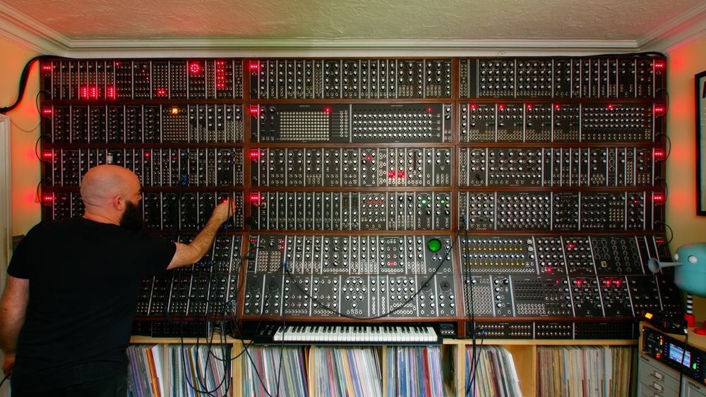
This instrument is neither powerful nor expressive:

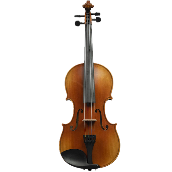
This one is both:

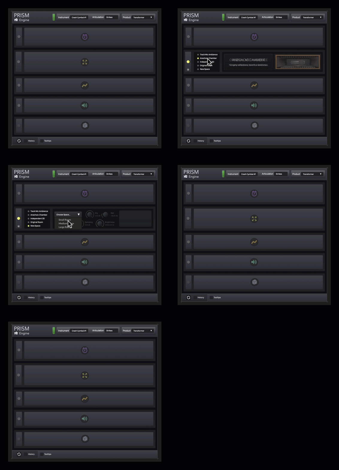
There's lots of ways to do this, of course. The one I've been using in HISE is Contextual Interfaces. My plugin has a zillion different parameters, but at any one time, the only ones visible are the ones which are relevant. The workflow is organised to guide the user, such that there's only a small number of things that the user would want to do (while still having the full power of the plugin at their fingertips). Here's a debug view of one section.

Controls that are not relevant are greyed out, with different levels of transparency. As you perform tasks, you'll see (in the background) widgets come closer as they become more relevant. If they reach the foreground, you can use them. Some widgets are initially amorphous — as they become more relevant, they began to take on clearer visual traits. These visual traits translate specifically to the widgets that are exposed at this level of specificity.
The six sections divide this section of the plugin into six workflows. While you're engaged with one of these workflows, you wouldn't want/need to engage with the others, nor care about visual feedback. For example, if the user is in the spatialisation module, they're not interested in gain-staging, so that's a separate module.
Although not shown here, these six modules are further collapsed into a single module, giving the interface a tiny GUI that is more powerful, intuitive and efficient. In turn, this whole section is one of seven sections in the plugin. Each of these sections have, in turn, been designed and delineated by mutually-exclusive workflows.
Let's go down the rabbit hole. For example, the gain staging module has a limiter. You can't access the limiter unless you're already looking at the clip light. Which you're only doing if you suspect your signal might be clipping. If so, then a solution to the problem appears right next to the clipping light — the limiter switch. But otherwise, the limiter switch is just noise. (To put it another way, nobody wants to use a limiter. It's only relevant if there's a problem.)
Going deeper: There's no controls on the limiter. Based on the context, there is only one thing they want the limiter to do — stop the clipping, with complete transparency. And if a tool only does one thing for the user, then it should only present one interface widget to the user. You may be thinking, "But limiters are not transparent, which is why they have adjustable parameters — so users can decide the trade-offs." And while that's true, it's also not the user's problem — it's mine.
Complex interfaces can also affect your sales. Prospective customers may think the plugin with lots of controls, expandable panels and such — is cool. But it's also overwhelming. They can't imagine themselves actually using it. Your user interface should look simple and feel powerful.
There are also practical concerns. Most people use laptops. Screen real estate is at a premium. Whenever a plugin is open, it will initially be obscuring some part of their DAW. And the last thing anyone wants is for a plugin to suddenly take up even more space. They may have carefully placed your plugin window so it's not stepping on anything — but if it suddenly gets bigger, all bets are off. When your interface expands, it may not even be on the screen.
Just my $0.02.
-
@Christoph-Hart As you can see, everyone is asking you to add this feature. It shouldn't be hard for you since lots of companies are using this feature.
@clevername27 while 100 people want this, it is very unreasonable for one person to come out and oppose it. If you don't want to, don't use this feature, it's that simple! When this feature is added, nothing will happen to plugins that do not use it. Many people have talked to you about this topic before, but you're still buzzing... Many experts here (plus tons of companies use this in the market) will not take GUI lessons from you. Please do not take such approaches.
-
This post is deleted! -
This post is deleted! -
@Fortune I thought @clevername27's post was very reasonable - and interesting, to be fair. What's the point in a forum if people can't express their well-thought-out opinions!

You don't have to read it... ?

-