CSS Discussion
-
When I add a class to a component, where does it live? I was expecting to see it added in the UI xml file but it's not there. Is it just interpreted by the script compiler at run time rather than being a static property of the component?
-
@Christoph-Hart How do we show and style the slider's Text? Not the value but the name of the knob.
Docs have references to the value text, the popup value and the input field but I can't se how to show and style the actual name of the know in CSS.
-
@dannytaurus Using Look and Feel
-
@d-healey I mean with the new CSS method.
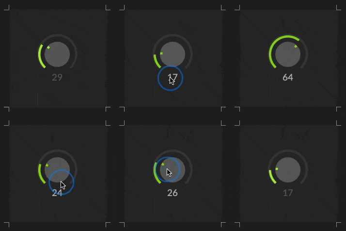
The example code has classes and selectors for all the main parts of the slider except the name.
https://docs.hise.dev/ui-components/plugin-components/knob.html#css-styling
This example uses a LAF object but doesn't call any LAF functions at all. It's just CSS and paths.
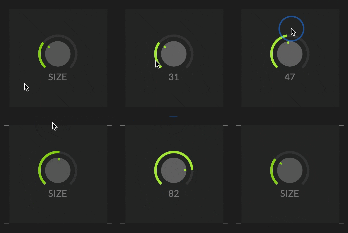
I'm looking for how to display and style the slider's name above it.

-
@dannytaurus said in CSS Discussion:
This example uses a LAF object but doesn't call any LAF functions at all. It's just CSS and paths.
Nice, got a snippet?
-
@d-healey There's a example on the doc page that was linked.
@dannytaurus I'm afraid you're running out of pseudo elements to use here. Rendering a knob with CSS does stretch the optimal use case a bit and you only have a
::beforeand::afterpseudo element that you can use for different things and both are consumed by the vector knob rendering (you would need another element that you then can overwrite its text using thecontentproperty).When I add a class to a component, where does it live? I was expecting to see it added in the UI xml file but it's not there. Is it just interpreted by the script compiler at run time rather than being a static property of the component?
Forgot to answer this. Yes the class is in fact not represented by a component property in the XML tree. The rationale is that it might suggest a no-code way of adding a CSS style to any component (currently you have to assign a custom script LAF) so people would be typing in the class in there and then complain that it doesn't work.
-
@Christoph-Hart said in CSS Discussion:
o people would be typing in the class in there and then complain that it doesn't work.
That would be me :)
-
@d-healey well in your case you were right because it was actually broken :)
-
@Christoph-Hart Could we have hardcoded classes for other elements?
Like
.scriptslider.text?I could get around it by drawing the slider name in the background path but that seems like quite a workaround.
-
@dannytaurus the text is not a separate component so I can't address it with another class selector.
a workaround.
Yeah, but as I said, using CSS for rendering a knob is bordering on "wrong tool for the job" and I've added the ability to do so just for consistency with the other elements.
What you could do is to show the text / value depending on the user interaction (like it is with scriptnode):
- by default the text shows the name
- if you hover over / drag it it shows the value
.scriptslider
{
	color: white;
	vertical-align: bottom;
	font-size: 0.8em;
	content: 'Funky'; /* overwrite the text to render. */

}

.scriptslider:hover
{
	content: ''; /** a empty string as content will use the default text (in this case the slider value) */
}
You can also pass in a variable if you want to reuse the style sheet with a dynamic name.
-
@Christoph-Hart said in CSS Discussion:
"wrong tool for the job"
Is that just from a HISE point of view?
CSS is used for styling all web elements, including complex media controls like sliders.
It gets tricky to maintain consistency between browsers but I imagined HISE as just another 'browser' that has a proprietary implementation of things like sliders.
Then we can target the various parts of the control, like we can with CSS on web sliders.
-
@Christoph-Hart The tip about overwriting the content on hover/active works great!

-
CSS is used for styling all web elements, including complex media controls like sliders.
Yeah, but there you have the ability of using multiple html elements and add javascript for the rest.
The CSS renderer in HISE is not 100% browser-compliant (it's not its goal and it never will be so you have to give up the expectation that you can just copy paste stuff that works in a web browser). It's a completely own renderer written from scratch with the emphasis on plugin UI elements. It is not intended to be the catch-all solution for graphics going forward - for complex elements (and knobs are directly at the transition between simple and complex elements) it's still recommended to use the HiseScript LAF approach as this gives you a much better way of controlling the logic.
The CSS renderer shines at simple elements - buttons, comboboxes & text input.
-
@dannytaurus said in CSS Discussion:
Is that just from a HISE point of view?
Yes, CSS is brand new in HISE so it has to fit into the existing paradigm which is very unlike a web browser.
-
@Christoph-Hart said in CSS Discussion:
for complex elements (and knobs are directly at the transition between simple and complex elements) it's still recommended to use the HiseScript LAF approach as this gives you a much better way of controlling the logic.
Gotcha. I thought CSS styling was the way forward but I misunderstood.
LAF it is for me then!

Still it's fun to see how far the CSS can be pushed.
-
Being the html/css lover that I am I was thinking about how I could make life more web developmenty when building GUIs in HISE. Especially with relative layout of components. I've come up with a little system using a json tree structure (because I'm not willing to figure out HISE's xml parsing).
The basic idea is you define your layout in a JSON object, like this (including css classes/properties).
const data = [
    {
        type: "Panel",
        id: "pnlContainer",
        css: {classes: "container", properties: {}, pseudoState: ""},
        properties: {x: 0, y: 0, width: 500, height: 500, bgColour: Colours.black},
        children: [
            {
		type: "Panel",
		id: "pnlHeader",
		properties: {x: 100, y: "50%", width: "100%", height: "10%", bgColour: Colours.white}
	    }
        ]
    }
];
Then I have a set of functions that processes this object and constructs the GUI based on that structure. Much nicer than writing (and rewriting) the same commands to create a GUI in every project.
I have spent literally about an hour putting this together so it's very early stage. But before I progress with it I wanted to share it and ask if anyone else has an interest in it, or if we'll ever see an official markup system for defining HISE GUIs - I mean the GUI is already there in XML?
-
@d-healey you're a bit in the uncanny value between the multipage creator concept (which uses almost the same structure) and the default HISE component tree layout so the chances of this getting somehow merged into the official HISE codebase are slim as it will be very confusing to add another layer of abstraction there.
This being said, you're of course free to build up your component tree as you see fit and this approach can be useful if you're into declarative UI building. It looks pretty similar to what you get if you press J to show the JSON:
[
  {
    "type": "ScriptPanel",  "id": "Panel1",  "x": 118.0,  "y": 98.0, "width": 380, "height": 310,
    "childComponents": [
      { "type": "ScriptButton", "id": "Button1", "x": 22.0, "y": 22.0, "parentComponent": "Panel1" },
      { "type": "ScriptButton", "id": "Button2", "x": 162,  "y": 22.0, "parentComponent": "Panel1" }
    ]
  }
]
BTW, this exact JSON structure will be pasteable into the dynamic container thing that I'm working on, so you can build the UI with the interface designer, copy the JSON code and paste this into the API method to build the dynamic interface once it's ready.
Now the differences between the JSON I posted and the JSON you're suggesting comes down to a few details and might be just a subject to data processing that can be done on the scripting layer. What I can add to HISE is the ability to build the component tree from the supplied JSON method, so you just pass in
Content.buildInterfaceFromJSON(jsonData)and it will replace the current UI components with the ones defined in the JSON. -
@Christoph-Hart said in CSS Discussion:
Now the differences between the JSON I posted and the JSON you're suggesting comes down to a few details
Ah that's a good point, I'll follow the interface designer JSON structure too so it is interchangeable as much as possible.
@Christoph-Hart said in CSS Discussion:
so you just pass in Content.buildInterfaceFromJSON(jsonData) and it will replace the current UI components with the ones defined in the JSON
Will it filter out properties it doesn't recognise? So I can continue to implement the css class assignments in the JSON?
-
Do the width/height css properties do anything for buttons? I see width used for sliders in the docs but when I try to apply it to a button I see no change.
-
 D David Healey referenced this topic on