TooltipPanel new Fade and ShowIcon data properties (PR help please!)
-
I needed to make a couple of small customisations to the TooltipPanel which didn't warrant building a fully custom component.
Here's the PR: https://github.com/christophhart/HISE/pull/799
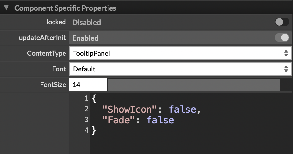
Fade [boolean] enables or disables fade animation when tooltip appears/disappears.
ShowIcon [boolean] shows or hides the info icon. If false, it removes the text offset too.Both default to true for backwards compatibility.
Thing is, I don't know how to get the new default props showing in the Data section of the UI.
Can anyone help with this?
It works fine when I type them in, but they should appear when the component is added too.
Meat Beats: https://meatbeats.com
Klippr Video: https://klippr.video -
@dannytaurus Check this commit, I think it works the same way. I added a default property.
https://github.com/christophhart/HISE/pull/681/commits/82fa3a1b5da881bdd569d12c96df52c1e733d695
Free HISE Bootcamp Full Course for beginners.
YouTube Channel - HISE tutorials
My Patreon - More HISE tutorials -
@d-healey Thanks, will do

-
@d-healey I checked the commit you posted. You were adding a new default property to the DraggableFilterPanel, right?
When I add one to the plugin UI, the only default params that show in the Data section are ProcessorId, Index and FollowWorkspace.
In the Draggable FilterPanel docs, I see all the properties I would expect - AllowFilterResizing, ResetOnDoubleClick, etc. - but they're not in the Data section of the UI builder in HISE.
Also, your new HandleSize default property isn't in either the Data section or the docs.
I'm so confused!

Meat Beats: https://meatbeats.com
Klippr Video: https://klippr.video -
@dannytaurus I haven't checked the differences against yours, but what about this one? https://github.com/christophhart/HISE/pull/374/commits/61ed43ee88e258b61831dfbb6202ca64a5e8fbf2
Hise made me an F5 dude, any other app just suffers...
-
@ustk Yeah, cheers. That looks more like what I'm trying to do

-
@ustk Thanks for the pointer. I added another commit other than the PR to ensure the new props are shown in the Data section of the UI.
-
 D dannytaurus marked this topic as a question on
-
D dannytaurus has marked this topic as solved on