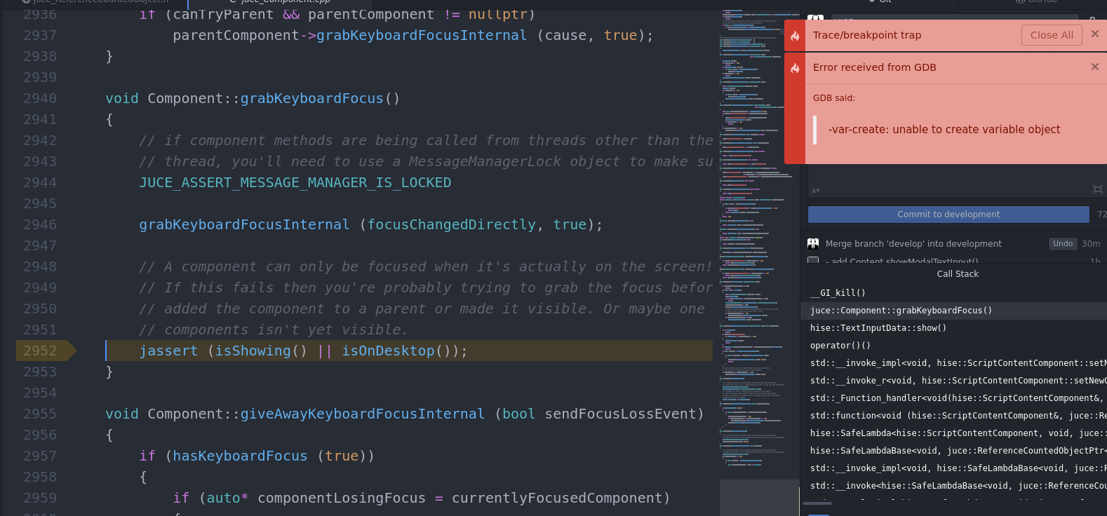
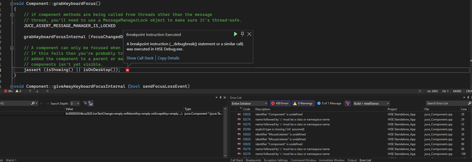
Script panel label keyboard entry?
-
Alright, took another spin at it and I found the most embarrassing code typo ever that caused an infinite loop and crash when using the
parentComponentproperty. Should be fixed now.Here's a snippet that lets you open a text box for sliders (as soon as you set the
sliderStyleproperty to"Horizontal" / "Vertical"you'll loose the text box so this brings it back with even more customization options:const var textInputBroadcaster = Engine.createBroadcaster({ "id": "text-input", "args": ["component", "value"], "tags": ["text-input"] }); const var List = [Content.getComponent("Knob5"), Content.getComponent("Knob4"), Content.getComponent("Knob3"), Content.getComponent("Knob2"), Content.getComponent("Knob1")]; textInputBroadcaster.attachToComponentMouseEvents(List, "Clicks Only", ""); textInputBroadcaster.addListener("", "show textbox", function(component, event) { if(event.shiftDown && !event.mouseUp) { var obj = { "text": Engine.doubleToString(component.getValue(), parseInt(Math.log10(component.get("stepSize")) * -1)) + " " + component.get("suffix"), "x": component.getGlobalPositionX() + component.get("width") / 2 - 30, "y": component.getGlobalPositionY() + component.get("height") / 2 - 12, "width": 60, "height": 24 }; var c = component; Content.showModalTextInput(obj, function[c](ok, input) { if(ok) { c.setValue(parseFloat(input)); c.changed(); } }); } }); -
I still don't see a text box.

-
@d-healey Hmm if I comment out the call to
grabKeyboardFocus()I don't get an error but I still don't get an input box. -
@Christoph-Hart said in Script panel label keyboard entry?:
I found the most embarrassing code typo ever that caused an infinite loop and crash when using the parentComponent property
lmao

happens to the best of us
-
@d-healey how does this happen? I don't hit that assertion, but it seems that it tries to add the text input to a component that isn't visible yet.
The entire system was not trivial to implement because you have to send a notification from the scripting thread to the UI which resides on a completely different data model, but I think I got all edge cases sorted out with the last commit (and it's working fine here).
-
@Christoph-Hart This is the snippet I'm testing with
HiseSnippet 862.3ocsUssaZCDDcMD2VnWTiT+.r3IGIZDjlldSUkBjTgZHAURi5CUJZwdHrh06ZsdcBnpH0O49GzNqsALojnJTievxykyrmY1YF2SI8fnHohXU5jog.w5Q18mJziZMhxDjNsIVOwlIBi0CjSzPjlzbZHMJB7IVVE+jwGqRaPRd90GZR4TgGrPEgbpj4AGxBX5EZ603yLN+.pObBKHm261nimTzRxkwHeJZWiDR8FSOGNhZbqfMw5d66yzRUeMEICwZilR+o8GIuTj5+orH1.NXDpS5iAJU8ARtugwFsjViXb+dyx6HBFkdKpBESqBOytKymMW+hpwSSL3r.Q95gUgkoWwknW87zqVN5sBJYkiRajRoMs66oXg5EVL74g1cDZPMjhk87TI0WRgxEraIQOD5sCnigCTnvbDt6UqVUG70VuqbYrzGoctfpbBUxPm2W9GkKUYRk25TuVU7qoy+5RludDJ8lDoQ.67QZTbmcKeEFFlfyDfyvXgmlIENRQyXsVJpangRxc8jAgRARnp3gwigsLGDanialToRJPGqDXrJMi5QXMrqzmxOAlfzGaGcMjr57iwUNtpSReJF.LdFjQRNrcnhIznULCutxT2Q8WguLTe1ocNnaMijtUxneks1NxnOIIZQ47AXuo60yNLR4x7ijZ3XgaRFV9pxNW2zvgqzVVr3fZklMCMpaCnqHNX.nxWeMNhcRK2dZeysm4md7RKK4bTJ5HX5iCAwMMSQxpk3WesSaplZ5oyzg9EBJMyPAq1vE3BhzN7R1sgnwZYXhuYW.Dq6qSr9jr9+zBNg4a.jU8ISluEow2aLctvOOqAHnXNYFZODnJgY1HhdAzQzSA3EpQlE0UFfGEUgHsJP96YObpW5Gyo5kWEX1+kY.u.VZ9yLiIhX5o42O9ea+v+JE2ztGS6MZ0brvJ3HdMcWvwrspO1d+gCAO8BBtg8Ae6tYEJ4KxXMSbdWpVwv1C6ihC5i+XwCvSWH.tY..urMPSjqYjMUf9fvOQ323Slw5FYqLi0mYjDP8Txy7RG6L6sePhFjShjeYUxtqQ1oNIYTDwYWa6Zj.ra7LOOS5+bb5Y0X1YMv7h0.ytqAlWtFX1aMv7p0.yquULlEAeLVKCRGGPE81OY+jk09IaJR5BI+A36cfR. -
@d-healey Nope, works here. Might be a Linux thing. Can you check on another OS?
-
@Christoph-Hart Yeah I suspect the same. I'll try it on my Windows VM.
-
@Christoph-Hart Not working here on Windows, using latest develop branch

@aaronventure Does it work for you?
-
@d-healey Ok, but what do you do? I load up the snippet and can click on the button, then it will open a popup.
Are you testing in HISE or an exported plugin? Where's the UI - in the interface designer or another window. Do you have another floating window with the interface open?
-
@Christoph-Hart said in Script panel label keyboard entry?:
Ok, but what do you do? I load up the snippet and can click on the button, then it will open a popup.
Yes that's what I'm doing too.
Where's the UI - in the interface designer or another window. Do you have another floating window with the interface open?
Aha mystery solved. I was just in the interface designer. If I open the floating interface preview it works!