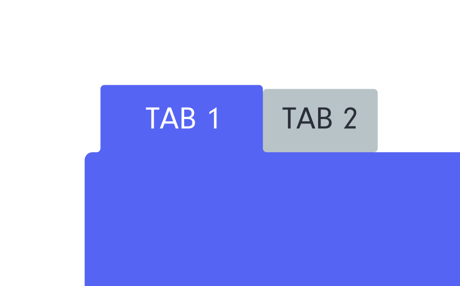
for all the LAF Wizards - reverse rounded borders
-
I am trying to achieve this look in HISE. I build this using Figma with a lot of hackery. I believe there would be the base panel and then a top panel for the navigation, probably something with paths. Ideally I would be able to choose the border radius and not rely on fixed svg paths.
Is someone up for the challenge?

-
@oskarsh Alright, a challenge with some quadratics is the perfect time to come back after months of inactivity !
I was happy thinking there would be some trigonometry involved here, but... Disillusion...
HiseSnippet 1324.3ocsW0raaaDDdosYPjRSQCP68E5jTghfrRZZPCRi7eJvnN1BVpIsHHvXI4JoslZWVxk9mVXf9HzGg9nzi8ReW5gdOcFtjhjVpJ1BsT.Bbme+1Ymclg8CUt7nHUHwpxvKC3DqOxdvkR8jclvDRx96Rr9L69LI2eHyI5MBfQb3Y7Hx1WFvhh3dDKq0eIJpUkMHIO+0K1l4yjt7bRDxqUBW9AhoBcN09c+FgueOlGenXZAoeb28cUxcT9pX.Vqa2lDvbOkMleHCEaMah0c1ySnUgCzLMfEq02V4c4fIpykF4esHR33ywEaRF.FxPlryDguW+rsbDgXsQ+7.v5l.vmZ+JgmXF87.wmjvflqQwXf0ZKCRadKfjUAHsgAROvdfanHPmyAwy8r2Wp4giXPntHTLxRV6Oss2QARH0slxNk2KDVLSi5Ooc6lT3uFOqZUHbGoomwBoNZYD84z2lo3XtdG0z.kDVTu11wZsRtYsFMqRm6YYpzoVi2UxOAR+k3mjDtakaRzXNubL3hm7rBDF9liNAIdL8yocJIpl4bvV8.VY12MjCmjGnbY9GnTmtkzqGm6WGCWFYaExGKhfvYuXoqVnj0q4ExNenZ7XetYaWqIcTFywMoJmenQ0etZEzeLvUv5VLvMOyPJXNu2momfdrR0JAshzrP8g7yGD6jPOYuzjhGf.WegjOTUm81Nui9PZYd+XLCPlV3lK.xrIMewwFuHFQqin5LleLuQ0J.Xmy1Gi58nj2Pk9WsOJjwEl2SEN0XsKQrnElo50bzUUqv8i3KETk8wMy2oDKXgqLA7bFGOebzD.KFmqVYbqHLoDqakGEouH4b1YrgA8qnsunWum1F+gpMt0HnJXxIZ..gOrkDZ9TCqNfwPJZ9EoBaLHlFtkuXrj6MDXUOSllyx3ZRq4BoYgbuZfJWgI0UqNRERq6PExjp.IYpNHNl6NfI+G8kiAmfkT96v78cfB00URT+Tpn4QiKjX3b10AZIgp6lcStIMM0CbdBdBP7fUKRyFwLTbYKgziewQipGzf97mmf3YjlYsFfR3QbDTGNyUF6mbJeUx1t7SA.dnRyORVOAKvlfdcViFsPdoNxmGtP1XutvkoXcY7TGdXwHAJHzLnbGl6by5v3ZpnTPPkbeoPeT.OccOkuG14.ee99QjzRRPmo0RQHHpNouzGm1WxTsiH.iTwNsIAIA9DKaqjl52BU6joZ9DEjuc+cYZF1cLEN.DC3gZAFIr1keFLdgoWYE6c4QmpUAP.aVCBf7M.wWLyk+xocub1ht7tS3hwSJL5xW28bgmdRNggcCYdB0KCUwAlHY1EdPl672du98nT3kP3fyd3Vaig5aC55T.c+d3+on62d+vqitNkP28Ln69YSgf8ZS.2cMiFVLxQ99BXiHxPhs0uB4AY.015O.lNpPOd3.wOUZRwEE2xK4sXpcJR9rr6AVqWbST8CrI5rhahEDHW7Fq7lHS1qsIxHSleHPX7SkWrOSWdlTb36TFPYjRCBhC6IiD5KKdU5VLnZ6kNn5MEhOvtuP6NYwXbsEfQrRy+CXLc796au2nQbWcN.2vt22spyx+Ab+wpXsPN9ULcn.RurOLd5.3n1kCdWBIcQXZzZX4Qy51Y0KGvkdIKdO7jxbSbsUJyMyXRlxbCUm3Zpuhe.wcSn.XRl78RUreEtllWQ1tcq1jov2xbhqKt8eHTLZw5zYEz4QqfNOdEz4KVAcdxJnyWtB57zkpC9YjaEqUSMWG.B82Ko8lk0dRFjYkjER9G9O6Pc.I took the easiest path, but it could've been done with a hidden row of buttons and the path entirely drawn in the panels themselves... This would have prevented the little gap between the buttons and the panels (although a 1px offset fixes the issue). This would also helped removing the gap between the buttons, or for instance using a long panel with mouse detection instead of the buttons... Many solutions for one problem !
-
@ustk amazing and super clean! Welcome back :)
inside the
onbtnsControlfor (btn in btns) { btn.getId() === component.getId() ? component.setZLevel('Front') : component.setZLevel('Default'); }Problem solved :) now they properly overlap as-well. I like using actual buttons instead of panels.
Thanks alot!