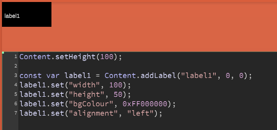
Left centre text alignment
-
Could we have an option to align the text to the horizontal left and vertical centre? Or separate options for X and Y.
-
You can use the same alignment ids as the Label uses:
const var Panel1 = Content.addPanel("Panel1", 0, 0); Panel1.setPaintRoutine(function(g) { g.setColour(Colours.white); g.drawAlignedText("Funky", [0, 0, this.getWidth(), this.getHeight()], "left"); // also: topLeft, bottomLeft }); -
Actually it's label text I'm wanting to align. I have a label that is larger than the text that it contains (so it conforms to a grid layout) but I'd like the text centred vertically, I can do this by changing the size of the label but that messes with the grid, or I can centre the text horizontally which also centres it vertically but then I have to shift the label left to get it to look left aligned, and that messes with the grid. :)
-
That's precisely why there is the
alignmentproperty in the label:[ { "type": "ScriptLabel", "id": "Label1", "x": 32, "y": 25, "width": 128, "height": 28, "alignment": "left" } ] -
I think I'm not explaining very well. Hopefully this image will help. The text is aligned left, but it is not aligned vertically central which is what I would like.

-
I really don't get it :) The text is aligned vertically in the centre, isn't it?
-
Maybe it's my eyes but to me it looks like the text is in the lower half of the label rather than central
-
Nah, it's your eyes :)
Just kidding, I just take the alignment in JUCE and pass it on to the scripting engine but I trust these guys to get it right :)
-
I'll just shift it a few pixels manually then until my eyes are happy :)